|
|
Post by omahayote on Apr 10, 2011 13:24:10 GMT -6
I have been playing around with the new symbol and I think simply putting a black border around the two interlocked letters defines and dresses up the look a lot.
|
|
|
|
Post by yotefan90 on Apr 10, 2011 18:52:02 GMT -6
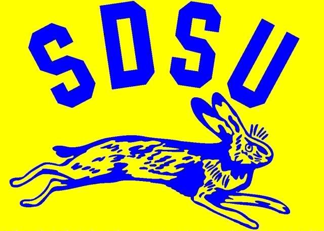
What did the baseball team have on their caps back in the 80's? It seems like I remember something that looks very similar to what this proposed new logo is.
Does anyone remember or have a picture?
|
|
|
|
Post by Yote 53 on Apr 10, 2011 19:23:38 GMT -6
Now that you mention it this logo is very similar.
|
|
|
|
Post by yoteforever on Apr 10, 2011 19:47:08 GMT -6
What did the baseball team have on their caps back in the 80's? It seems like I remember something that looks very similar to what this proposed new logo is. Does anyone remember or have a picture? That's it |
|
|
|
Post by coyotecrazie5 on Apr 10, 2011 20:28:01 GMT -6
agrees with earlier post. state shouldn't even use the interlocking SD since their name has state included in it. you dont see ndsu with a ND logo or north carolina state using the NC logo
|
|
|
|
Post by coyotecrazie5 on Apr 10, 2011 20:43:37 GMT -6
all in all i think the design is pretty weak
|
|
jackjd
Senior Member

Posts: 656
|
Post by jackjd on Apr 10, 2011 21:29:30 GMT -6
agrees with earlier post. state shouldn't even use the interlocking SD since their name has state included in it. you dont see ndsu with a ND logo or north carolina state using the NC logo Well, State's going to do what it wants and what it has traditionally done for a long, long time. SDSU has used some form of the two letters on top of one another for at least five decades (I base that on an acquaintance who was a letterwinner, had a letter jacket, about 50 years ago) and probably longer -- I wouldn't be surprised that atheltic letters at SDSU have always been one letter on top of the other. When I was in college and SDSU and USD gave letterjackets to athletes, both schools' "letters" were very similar S over D...SDSU's was yellow (on a dark navy jackets with black leather sleeves) while USD letters were white (on a red jacket with white leather sleeves). I think -- but am not certain -- that some time in the 1980s or 1990s, USD's letters on letterjackets were changed to the large U with small S and D beneath the U (I always thought that was a good logo). SDSU athletic letter winners continue to receive the S over D in block letter form but they are larger than those awarded 10 or more years ago. They are not the "stretch" S over D like on SDSU's football helmets and a lot of clothing. When I was in college, NDSU letterjackets had N and D on top of one another in gold on a dark green jacket. UND letters years ago were also an N over D but I recall they were white on a kelly green jacket. I'm not sure what NDSU or UND do for letters now. Iowa State letterjackets: just a big gold I on a 'cardinal and gold' letter jacket. Guess what the U of Iowa does. |
|
|
|
Post by yoteforever on Apr 11, 2011 6:58:07 GMT -6
agrees with earlier post. state shouldn't even use the interlocking SD since their name has state included in it. you dont see ndsu with a ND logo or north carolina state using the NC logo Well, State's going to do what it wants and what it has traditionally done for a long, long time. SDSU has used some form of the two letters on top of one another for at least five decades (I base that on an acquaintance who was a letterwinner, had a letter jacket, about 50 years ago) and probably longer -- I wouldn't be surprised that atheltic letters at SDSU have always been one letter on top of the other. When I was in college and SDSU and USD gave letterjackets to athletes, both schools' "letters" were very similar S over D...SDSU's was yellow (on a dark navy jackets with black leather sleeves) while USD letters were white (on a red jacket with white leather sleeves). I think -- but am not certain -- that some time in the 1980s or 1990s, USD's letters on letterjackets were changed to the large U with small S and D beneath the U (I always thought that was a good logo). SDSU athletic letter winners continue to receive the S over D in block letter form but they are larger than those awarded 10 or more years ago. They are not the "stretch" S over D like on SDSU's football helmets and a lot of clothing. When I was in college, NDSU letterjackets had N and D on top of one another in gold on a dark green jacket. UND letters years ago were also an N over D but I recall they were white on a kelly green jacket. I'm not sure what NDSU or UND do for letters now. Iowa State letterjackets: just a big gold I on a 'cardinal and gold' letter jacket. Guess what the U of Iowa does. That logo about a U on top and smaller SD below came in 1975, the first year I lettered. It had red stitching between the white letters on a red jacket with white sleeves. |
|
|
|
Post by why on Apr 11, 2011 7:31:55 GMT -6
agrees with earlier post. state shouldn't even use the interlocking SD since their name has state included in it. you dont see ndsu with a ND logo or north carolina state using the NC logo then you may want to let San Diego State know that they have to change their logo, or Ohio State that they shouldn't just use a "O". The problem is the SDSU "SD" logo is much better than the new USD logo. |
|
chuck
Sophomore Member

Posts: 169
|
Post by chuck on Apr 11, 2011 8:10:56 GMT -6
"The new logo is just as flashy as the N of Nebraska. My guess as many of the people writing negative posts did so, then put on their baseball hat with a big red N."
I think this is a good point. Even the nation's flashiest university (hands-down), Oregon, has a pretty simple "O" as a logo. I think that could indicate that it is more what you do with it than what it is. My only concern is that it looks like a red San Diego Padres knockoff. There are some creative people on campus-I say open it up for submissions.
|
|
usdlaw
Senior Member
Posts: 930
|
Post by usdlaw on Apr 11, 2011 8:24:58 GMT -6
What did the baseball team have on their caps back in the 80's? It seems like I remember something that looks very similar to what this proposed new logo is. Does anyone remember or have a picture? I still have a couple of those hats. It's very close. My favorites were the old red and gray baseball hats and the red and white pin striped ones. I haven't had a chance to read all the comments yet. My first response when people ask me about it is "well it's better than U." It seemed to me that most of the haters on the Argus website were SDSU people or other non USD people. |
|
|
|
Post by 88grad on Apr 11, 2011 8:36:09 GMT -6
I think I could get into the new logo a lot more if there was just a U involved with it. I've always known USD by those three letters, it's never been South Dakota.
|
|
|
|
Post by Yote 53 on Apr 11, 2011 9:13:40 GMT -6
There seems to more concern from SDSU people over USD's logo than anyone else. From the comments in the Argus to the huge thread over at SDSUfans it seems the Jacks think they know what is best for us. SDSU fans should just stay out of our business and let us do our own thing. As for USD's new logo and State's SD, they look nothing alike. USD's letters are offset while SDSU has the "stretch" letters which are interlocking and centered. Not even close and hardly alike.
While I'll agree USD's new logo is pretty simplistic in design and kind of a hybrid (I see some Padre, but mostly Oklahoma influence with a little USC) I don't think there is a whole lot you can do with two letters. The offset interlock is Padre-like but they are different fonts, the font and offset is more like OU with the S being exactly like the S in USC.
If you want a simplistic logo and have two letters to work with than this is what you are going to get. If anything at least USD tried to differentiate itself a bit with the break in the D.
I hated the big U with the little SD underneath logo. Bleckkk, looks terrible.
I think most of you are missing the point of this. In state we will always be known as the U. That's how it is in all states. When in Iowa, you go to the University or State, same in other states. When you say U or University in conversation it is understood you are referencing the school in that state. When we are talking about out of state schools we say Iowa, Alabama, Florida, Oregon, etc. We want people in those states to say South Dakota, not USD. USD is three letters, South Dakota is the state and we are the state's school, we should be known for more than three letters, we should be known for representing the state.
Since this broke I've talked to a few people about this logo. There are a lot of ideas being kicked around. I've heard ideas like using the interlocking SD inside the paw. I've heard of some very cool designs for the new basketball floor. Some interesting and cool stuff I think you will all be excited about.
|
|
usdlaw
Senior Member
Posts: 930
|
Post by usdlaw on Apr 11, 2011 10:33:18 GMT -6
That's a good point about the in-state reference to the U or University, or State, but on a national scale it is South Dakota or South Dakota State.
I don't really mind the new logo. I can't say that I'm thrilled or excited, but it's a huge step up from the Udot. Man I hated Udot.
|
|
|
|
Post by Charlie on Apr 11, 2011 13:30:59 GMT -6
Just looked at the new logo. One word: BLAH!
|
|