|
|
Post by 88grad on Apr 9, 2011 7:50:36 GMT -6
Well, the new logo is out....http://www.argusleader.com/article/20110409/NEWS/104090330/USD-logo-tries-national-appeal-?odyssey=tab|topnews|text|Home
I can't quite decide how I feel about it. At first glance I thought "ugh, what the hell" but after reading the story I can see a bit where they're coming from. However, I can't change my initial reaction so I guess I'll have to grow into it so to speak. What does anyone else think about it?
|
|
kt
Freshman Member

Posts: 3
|
Post by kt on Apr 9, 2011 9:38:54 GMT -6
I like it, its simple and much better than the U.
|
|
|
|
Post by GoYotes on Apr 9, 2011 9:44:45 GMT -6
88 Grad - I agree with your initial reaction. If it takes an article to explain the meaning of the logo, then it is not a good logo. The logo needs to stand on its own.
|
|
|
|
Post by cowbellhero on Apr 9, 2011 9:56:26 GMT -6
Please don't take this the wrong way as I'm a State fan, but that logo sucks. It looks like they combined the Padre's logo with the USC or OU logos. Not a lot of uniqueness to it. It looks generic and copied. I know you want to set yourselves apart, but I do not believe this does it. It looks like a knockoff. Change the font and some lining around it. Make it your own. This seems it would do nothing for any of those goals stated.
|
|
jackjd
Senior Member

Posts: 656
|
Post by jackjd on Apr 9, 2011 11:37:45 GMT -6
Please don't take this the wrong way.... How was your blunt assessment supposed to be taken? That opening phrase reminds me when someone wants to say something rotten to me and they start with "No offense intended..." Right. I thought the better logo was the one from several years ago that had the large U with smaller SD underneath. |
|
|
|
Post by cowbellhero on Apr 9, 2011 12:22:26 GMT -6
I meant it as don't take it as a State fan hating on USD just to hate on USD. If I was a neutral party, then such a statement wouldn't be necessary. If was a neutral party, I would still hate that logo and bluntly say that I hate it. But being a State fan, one could take it as hating it because I'm a State fan.
|
|
|
|
Post by 88grad on Apr 9, 2011 12:23:38 GMT -6
If the intent was to "knock it out of the park", as I have heard, then I think this is more of a pop foul. I agree, the big U with the small SD underneath was still the best. Damn I miss it....
|
|
|
|
Post by omahayote on Apr 9, 2011 15:24:09 GMT -6
Looks good to me - nothing exciting, which my guess was the goal. When I played fb at the U our helmets had an underlined USD on the side in white. Never really liked it.
I hope they go bold with the redesign of their signature graphic - The Coyote. When they do that (hopefully soon) I think they should hire a firm that has worked with several top professional and college athletic programs with similar assignments.
Go South Dakota!
|
|
|
|
Post by Yote 53 on Apr 9, 2011 16:51:12 GMT -6
I've always been a fan of the "Paw". They should keep it as the primary logo for the athletic teams. Take a school like Iowa, they have the block I and the Tigerhawk. No reason USD can't have the interlocking SD and the Paw logo.
There are only so many things you can do with the letters S & D. I guess the logo isn't that bad.
|
|
|
|
Post by 88grad on Apr 9, 2011 17:23:27 GMT -6
State already has the S/D thing going on so to me it's not anything that's sets us apart. I've tried all day to like it but I just don't. Also wondering how soon the lawsuit the Padres will come! Come on Lawerence and Schiller.... not very creative.
|
|
|
|
Post by azsod73 on Apr 9, 2011 17:45:15 GMT -6
Three thumbs down. The proposed logo gets lost in the crowd. A suggestion: A bold "U" with a bold "SD" inside the uprights. Maybe it would be a retread because I freely admit to not being a student of history on this subject. J just think the "U" has always been shorthand for the University of South Dakota and it needs to be preserved in some fashion.
|
|
|
|
Post by Yote 53 on Apr 9, 2011 19:19:07 GMT -6
Apparantly this new logo is a throwback to one we had in the 40's. That's what i heard.
|
|
|
|
Post by Omahayote on Apr 10, 2011 10:32:58 GMT -6
Usd athletics has bigger issues then a logo. Most of the negative comments (not all) are from non- usd supporters. The new logo is just as flashy as the N of Nebraska. My guess as many of the people writing negative posts did so, then put on their baseball hat with a big red N.
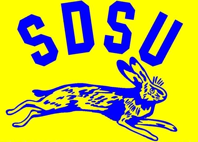
Also - I do like the sdsu interlocking SD. They certainly were not the first to do a design like that. One example of many possible examples: North Dakota had one dating way way back. Perhaps sdsu's interlocking symbol was a bad choice - missing a letter. Usd is south dakota (SD) and sdsu is south dakota state (SDS).
At the end of the day - who cares! Success of the institutions locally and nationally is where the real focus is.
|
|
|
|
Post by GoYotes on Apr 10, 2011 12:51:42 GMT -6
Still prefer the logo from several years ago with the U on top and the SD below the U. Could not find an exact replica anyplace, but the following link to the med school website has a version of the logo in the upper left hand corner as adopted for the med school. - www.usd.edu/medical-school/ (get rid of the medical markings and the symbol on top of the U) |
|
|
|
Post by yoteforever on Apr 10, 2011 13:00:18 GMT -6
Still prefer the logo from several years ago with the U on top and the SD below the U. Could not find an exact replica anyplace, but the following link to the med school website has a version of the logo in the upper left hand corner as adopted for the med school. - www.usd.edu/medical-school/ (get rid of the medical markings and the symbol on top of the U) That particular logo was introduced in 1975. Before that, and the logo was the SD that I think Yote 53 thought was the 40's. haha Just seems like it. I think the logo was then changed in the early 80's again, but I am less certain about that. |
|