|
|
Post by GoYotes on Jul 15, 2024 9:21:04 GMT -6
|
|
|
|
Post by GoYotes on Jul 15, 2024 9:29:47 GMT -6
 Here the old turf for comparison purposes. |
|
|
|
Post by captaincoyote on Jul 15, 2024 11:48:06 GMT -6
I like it. Clean with the current logo over the state which is in vogue right now.
|
|
|
|
Post by elcoyote on Jul 15, 2024 13:51:25 GMT -6
Is the resident turf monster going to relocate from the old to the new turf?
|
|
|
|
Post by sdyotefan on Jul 15, 2024 14:22:45 GMT -6
Anyone have a brief comparison of the old turf to the new? My recollection is the new turf is more user friendly (maybe except the monster?).
|
|
|
|
New Turf
Jul 16, 2024 6:29:54 GMT -6
via mobile
Post by 88grad on Jul 16, 2024 6:29:54 GMT -6
I’ve always wondered how do they ever clean/disinfect field turf? There’s all manner of nasty on that rug!
|
|
|
|
Post by GoYotes on Jul 16, 2024 6:50:53 GMT -6
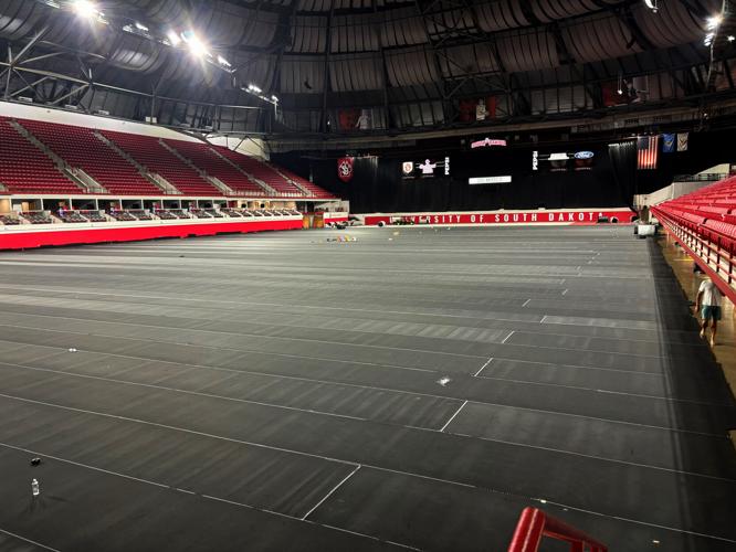
 This picture was in today's Yankton Press & Dakotan article about the new turf. It shows the underlayment being installed which makes me wonder how or if the turf will be removed for indoor track and field. |
|
|
|
New Turf
Jul 16, 2024 7:54:32 GMT -6
via mobile
Post by sdyotefan on Jul 16, 2024 7:54:32 GMT -6
I know with our turf in Rapid City, they periodically spray it with a disinfectant.
|
|
|
|
Post by captaincoyote on Jul 16, 2024 12:00:11 GMT -6
 This picture was in today's Yankton Press & Dakotan article about the new turf. It shows the underlayment being installed which makes me wonder how or if the turf will be removed for indoor track and field. Unless there is a surprise construction project to build a new indoor track by December, I have to imagine the turf is removable. |
|
|
|
Post by coyotecrazie5 on Jul 17, 2024 16:37:20 GMT -6
It looks like the turf will extend further out of bounds and hopefully alleviate some slips from the old open concrete.
The new turf was needed and hopefully the paw is bigger
|
|
|
|
Post by Yotes on Jul 18, 2024 17:25:06 GMT -6
Not sure what to think of the design until I get in the building. I love the pawprint logo in every other application (it is absolutely perfect on the basketball court), hope it works as the centerpiece on the football field. The lettering in the endzones looks kind of odd in the 2D concept.
Not sure if the state outline does anything for me, but it's faint enough to look past if you don't like it. UNI has the same thing going on and it's easy to ignore.
|
|
|
|
Post by captaincoyote on Jul 29, 2024 13:00:31 GMT -6
Jay Elsen is reporting that the faded South Dakota outline didn’t work out, so they scrapped it. Still looks great!
|
|
|
|
New Turf
Jul 29, 2024 18:30:06 GMT -6
via mobile
Post by Yotes on Jul 29, 2024 18:30:06 GMT -6
I am not a fan of using the state outlines. I'm a little glad they dropped it. Looks just fine with the simple paw print logo.
That endzone font seems odd though. Very jagged.
|
|
|
|
Post by yodayote on Jul 30, 2024 6:55:43 GMT -6
wow, looks great!
|
|